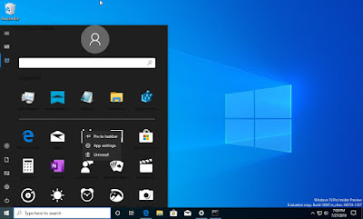
A test preview of Windows 10 released by mistake brings up a completely reorganized Start menu.
Even the older ones sometimes make meatballs. As proof, Microsoft has just released to all members of its program Insider a preview of the next major update of Windows 10, the build 18947, which corresponds to the version 20H1 of the operating system, supposed to be released in the first half (H1) 2020. In fact, instead of being tested by a handful of hand-picked users, it is accessible to all "Insiders" who participate in the evaluation program. Admittedly, this premature diffusion is not catastrophic, but it allows the curious to taste very early in advance some novelties, and even functions that may not be integrated into the final version, as explained by Neowin. a site that closely follows the news of the giant Redmond.
So a prominent member of the Insider program known as NTAuthority immediately noted that Microsoft was working on a new Start menu. As the screenshot posted on his Twitter account shows, this essential element of Windows should be the subject of a complete overhaul that should significantly change its use.
The most visible change concerns the famous dynamic tiles appeared with Windows 8 - that many consider as cumbersome as useless - which disappear in favor of fixed icons giving access to a multitude of practical functions - software, parameters, accessories, etc. In addition to the suggested applications, there is the integration of a search field, a function now separated from Cortana, as well as the enhancement of the user account and its avatar.
Again, this is just a rough draft for privileged user reviews, and nothing says that the future Start menu looks exactly that way. What is certain, however, is that Microsoft is actually working on the issue. Good news as this central menu really deserves a serious refresh. To be continued.
